If you’ve created one of these 7 types of products to sell on your blog, or you’re going to start offering a service to your readers, then you need a sales page.
The sales page is (not surprisingly) a page on your blog that’s all about your product or service. You can link to it in the navigation menu, from an ad on your sidebar, from your social media accounts, and from guest posts.
As an example, here’s the sales page for Digital Photography School’s Photo Magic ebook.
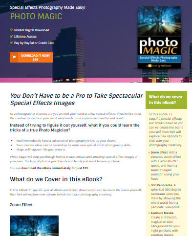
While sales pages don’t need to be complicated, creating your first one can be daunting. You may have seen all sorts of highly designed sales pages on large blogs and thought, “I can’t do anything even remotely like that”.
But all sales pages have similar elements, which you can think of as ‘ingredients’. Those elements are:
- A clear, compelling headline
- An image of the product or service
- An explanation of exactly what’s included
- A list of benefits the customer will get from the product
- Testimonials from satisfied customers
- The price (and the different pricing options, if applicable)
- A money-back guarantee (if applicable)
- A buy button
- No sidebar
Here’s what you need to know about each one.
#1: A Clear, Compelling Headline
Sometimes you can use the name of your product or service as the headline, providing it’s interesting and self-explanatory. But in most cases you should come up with a headline as if you were writing an advertisement.
Here’s an example from Copyblogger’s “Authority” membership.
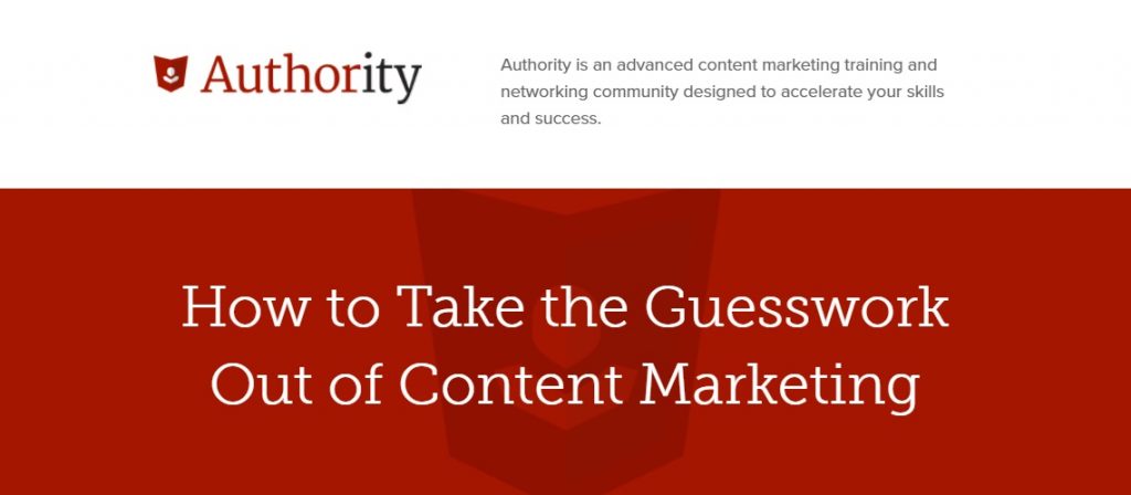
Their sales page begins with a clear statement: “How to Take the Guesswork Out of Content Marketing”, followed by supporting copy about it being a training and networking community.
Try coming up with several possible headlines, and ask your readers (or fellow bloggers, if you belong to a mastermind group or similar) which one they think works best.
You might also want to look at some of the sales pages of products or services you’ve purchased, to see what they did. Do the headlines grab your attention and draw you in? How do they do it? (And are any of them a bit over the top and potentially off-putting?)
#2: An Image of the Product (or Service)
Even if your product is digital, or your service is something fairly intangible (e.g. email consulting), you need an image.
Here are some ideas:
- If you have a physical product, use high-quality photos that show it from different angles, or perhaps in different operating modes.
- If you have a digital product, take screenshots of it. If it’s an ebook, you might want to create a ‘3D’ version of the cover to use on your sales page. (A cover designer should be able to do this for you. Alternatively, there are plenty of online and downloadable tools you can use.)
- If you’re providing a service such as consulting, coaching, an in-person workshop, or similar, use a photo of yourself. If you don’t have any professional headshots, ask a friend or family member to take several different shots so you can select the best.
- If showing your face isn’t an option for any reason, think of other ways you might include a relevant image. For instance, if you’re an editor you might have a photo of your hands on the keyboard.
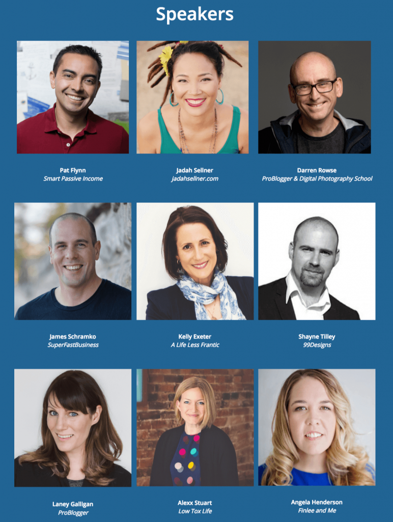
On the 2017 ProBlogger Evolve Conference sales page, we had photos taken at past events plus headshots of all the speakers:
Normally, you’ll want to save your image as a .jpg file so it loads quickly without losing much quality.
#3: An Explanation of Exactly What’s Included
Sometimes it seems obvious what the customer will get when they buy your product. But always spell things out as clearly as possible so there’s no room for doubt or confusion.
For instance, if you sell software you might want to make it clear they’ll receive a password to download it from your website. Otherwise, they might expect the software to arrive as an email attachment or even a physical CD.
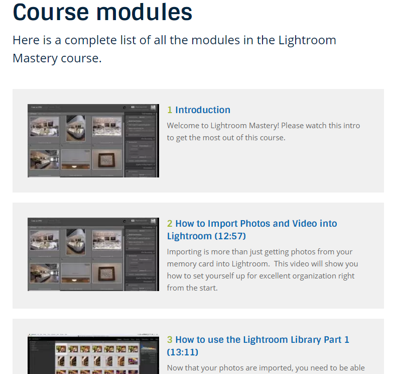
With an ecourse, you’ll probably want to include at least the title of every module or part. And with an ebook, you may want to provide a full chapter list. Here’s what we do for our courses over on Digital Photography School. (This example is from the Lightroom Mastery course.)
#4: A List of Benefits the Customer Will Get
When you’ve created a great product or service, it’s easy to get carried away with the “features” – the nuts and bolts of how it works.
But customers don’t buy features – they buy benefits. (Or, as Harvard Professor Theodore Levitt put it, “People don’t want to buy a quarter-inch drill. They want a quarter-inch hole!”)
Think about what your product (or service) will help your customer achieve. Will they save time, avoid silly mistakes, or overcome fears?
You might want to list a benefit for each feature. For instance, if you offer website setup and design services, some of the features might be:
- You’ll get your own domain name
- Your site will run on WordPress
- Your site will feature responsive design
- You’ll get unlimited email support
But these features may not mean much to someone who’s new to websites. They might not even know exactly what a domain name is, let alone why having their own matters.
Here are those same features, along with their benefits:
- You’ll get your very own domain name: you’ll look professional from the moment someone sees your blog’s address.
- Your site will run on WordPress: this popular website platform lets you easily make changes without touching a word of code.
- Your site will feature responsive design: it can tell when someone’s visiting from a mobile or tablet, and adjust (just for them) accordingly.
- You’ll get unlimited email support: while you’ll be able to update every aspect of your site on your own if you want to, I’ll always be available to help.
You can see how adding simple, clear benefits makes the offer sound much more attractive.
#5: Testimonials from Satisfied Customers
One crucial sales tool is what other people say about your product or service. Readers will (rightly) treat your own claims with a little skepticism – of course you think your product is great. But what do other customers think?
Testimonials are quotes from customers recommending your product. You could think of them as reviews, though they’re invariably focused on the positive. And each testimonial may only talk about one or two aspects of the product.
Of course, before you launch your product you won’t have any customers. To get your first few testimonials, you may want to make advance copies of the product available for free (or very cheap), or offer your services for a nominal fee, or even free. You could ask people on your blog or social media sites whether they’d be interested in using your product and providing a testimonial.
Here’s how Erin Chase from $5 Dinners incorporates testimonials for her meal plan subscription:
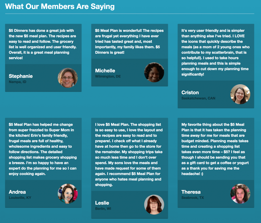
Ideally, you’ll want to use the full name and a headshot of anyone providing a testimonial to prove they really exist. But ask permission before doing it – some people may prefer to be known by their initials alone.
#6: The Price (and Pricing Options)
It probably goes without saying, but at some point you’ll need to let customers know how much your product (or service) costs.
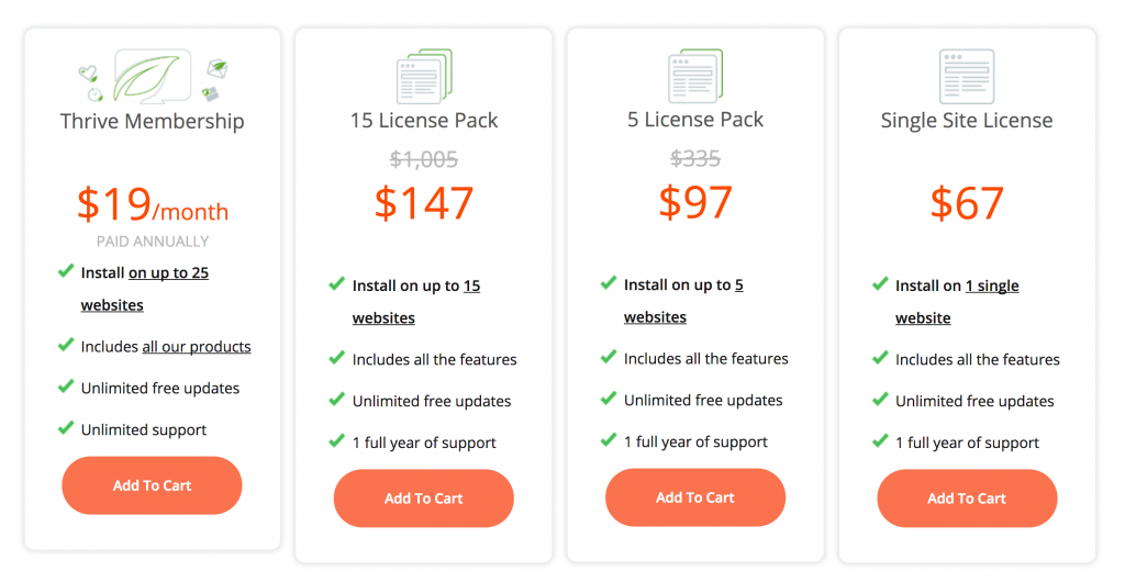
Be clear about the price, and exactly what it covers. If there are several options, you may want to use a pricing table (showing the options side by side) to help customers choose.
Here’s what Thrive Themes does with its Thrive Leads product (affiliate link), so customers can compare the monthly subscription to all of its products with the price of just Thrive Leads:
We have a Thrive Themes Membership for ProBlogger, and now use it to create all of our sales pages. Check out their sales page so you can see what’s possible with their drag-and-drop builder, Thrive Architect.
#7: A Money-Back Guarantee (if Applicable)
Providing it’s reasonable to do so, offering a money-back guarantee can help those customers ‘on the fence’ decide to buy. This is particularly true for digital products such as ebooks or ecourses. If they buy it and realise it’s not what they wanted, they can get a refund.
With services you might offer a trial period, or a short free consulting session, to help customers make up their mind.
Most bloggers find that very few customers ever ask for a refund, but giving people the option results in more sales. A standard money-back guarantee period is 30 days, but you might offer a longer period if your product is quite involved (e.g. a 60-day refund period on a six-month ecourse).
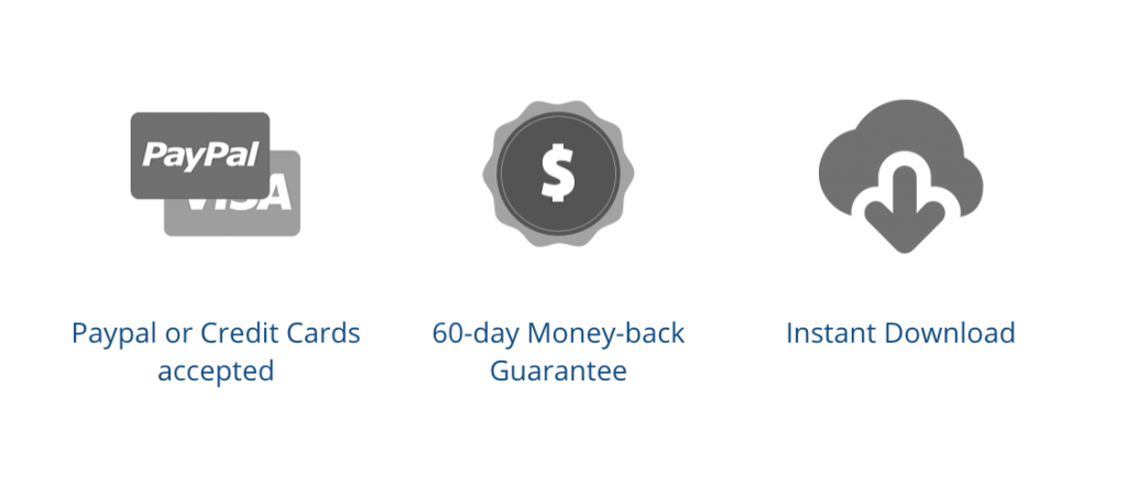
Here’s an example from a recent Digital Photography School deal. And you can check out the full sales page we built with with Thrive Architect (affiliate link)
#8: A “Buy” Button
This seems so obvious that you’re probably wondering why I’m including it. But if you’re creating your first sales page, you may not have given it much thought.
To sell your product or service, you’ll need a “buy” button. It might read:
- Buy now
- Add to cart
- Sign up
- Join now
or whatever makes sense for your product.
You can easily create a button using PayPal. If you want to style the button yourself, you can create any image and use the PayPal button link. (PayPal currently calls it the “Email payment code”. It’s just a URL you can send by email, use in a sales page, etc.)
If you want to automatically deliver a digital product when someone makes a purchase, you’ll need to use a third-party website or tool such as Easy Digital Downloads (affiliate link), which is what we use at ProBlogger and Digital Photography School.
Experienced bloggers sometimes split-test different button text, and even different button colours. But the most important thing is to make sure:
- it’s clearly visible and easy to find (you may want to include several buttons on the page
- it works.
#9: No Sidebar
This final ingredient is one you’ll remove from your sales page, rather than add. If you look at the examples I’ve linked to in this post, you’ll see that while they all look very different in terms of design and layout, they all have one thing in common.
They don’t have a blog sidebar. And there are no interesting links and widgets to distract the customer from making a purchase.
Many bloggers use special software to create sales pages without sidebars (and even without the navigation bar or other standard elements on their blog). But you may be able to do it with your current WordPress theme.
When you’re editing a page, go to “Page Attributes” and look for an option called “blank page”, “no sidebars”, “full width” or similar:
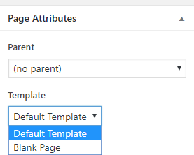
Simply select the appropriate option and update your page: the sidebar should disappear.
I hope I’ve made the process of building a sales page a little less daunting. By gathering these ingredients one by one you can put your page together a bit at a time, rather than trying to write the whole thing at once.
Best of luck with your sales page, and your first product or service. I hope it’s the first of many for you.
The post 9 Key Ingredients for Creating the Perfect Sales Page appeared first on ProBlogger.
from ProBlogger
http://feedproxy.google.com/~r/ProbloggerHelpingBloggersEarnMoney/~3/j4uwwZQ2RqY/
No comments:
Post a Comment