 Open up a new tab in your browser and go to the homepage of your blog.
What do you see?
There’s a good chance you see your most recent posts. This is, after all, what most WordPress themes default do. And if you’ve been blogging for a long time, it might be how you expect a blog’s homepage to look.
For some bloggers, it’s a perfectly good choice. But for others, a list of posts isn’t what they want first-time readers to see.
Many large blogs use a static homepage to quickly introduce who they are and what they do, and to point readers towards specific actions (which might well include reading their blog).
Here’s the difference:
Tim Ferriss’s homepage is a classic blog one, with the most recent post at the top:

Copyblogger’s homepage, by contrast, is a static one:

Of course, many blogs with static homepages list their most recent posts. For instance, on ProBlogger we have our latest posts and podcasts listed on the homepage:

But we also have lots of other elements, such as our “I need help to…” section that links to our different portals, all designed to meet different readers’ needs.
Could a Static Homepage Be the Next Step for Your Blog?
In the podcast episode on 3 Key Things Bloggers Do to Grow Their Blogs into Businesses, I talked about how blog homepages have evolved over the years – from the long list of full posts that was standard when I started in 2002, to the portal-like static homepages that are becoming increasingly common today.
As John Stevens puts it in his post The 9 Conversion Habits of the World’s Most Successful Bloggers:
Create a homepage instead of directing users straight to your latest blog posts. This gives you an opportunity to do so much more than just make them read your latest content.
So should you consider shifting your home page from a classic list of blog posts to a static page?
Absolutely.
But first, here’s something to think about.
How Does Your Blog Make Money?
If you make money from advertising, it makes sense to design your blog to maximise page views. Having a list of blog posts as the front page might be working perfectly well for you here. And you may not have much else you want to point readers towards, anyway.
But if you make money from selling products or services, a static homepage would likely be a better fit for you. It lets you get them right in front of new readers, rather than having them tucked away on your sidebar.
If you use your blog in a slightly different way – as a showcase for your writing, perhaps, or as a way to build recognition within your industry – then either type of homepage can work just fine. You might want to look at what people with similar blogs are doing.
How to Create a Static Homepage
The good news is that (technically speaking), it’s easy to set up a static homepage on any WordPress blog.
Here’s what you need to do.
Create Your Homepage Itself
#1: Log in to your WordPress dashboard, and click “Add Page”.
#2: Create the new page with whatever content you want there. (We’ll come to what you might include in a moment.)
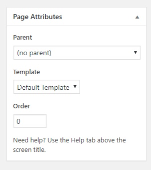
#3: (Optional) Remove the sidebar(s) from your new page. Find the Page Attributes box (probably on the right hand side of your screen), and under ‘Template’ select a ‘No sidebars’ or ‘Full width’ option. (This is available in most themes.)
It’s up to you what title you choose for your page. “Welcome” or “Home” can work fine, or you can just leave it off if you don’t want a title on your homepage. (You can still publish the page without a title.)
Set Your New Page as Your Homepage
#1: Go to Settings → Reading. Under “Your Homepage Displays”, select “A static page”.
#2: In the “Homepage” drop down, select the new page.

#3: Click the blue “Save Changes” button at the bottom of the page.
Now, when you visit your blog’s homepage, you should see your new page there rather than your latest blog posts. You can easily toggle it back if you want to just test it out for now. Just change the “Your Homepage Displays” setting to “Your latest posts”.
What Should You Include On a Static Homepage?
It’s entirely up to you what you put on your homepage. However, most bloggers have most (if not all) of the following:
#1: A mission statement or value statement, making it clear what readers can expect from the blog, or from you.
For instance, Rachel Corbett’s personal blog describes her on the homepage:

On Digital Photography School’s homepage, we have:

#2: A newsletter signup button or form. Many blogs feature this prominently on their homepage, as getting new visitors onto your email list is a great way to make sure you can stay in touch.
Here on ProBlogger, we have an orange “Subscribe to ProbloggerPlus” button near the top of our homepage, and a signup form at the bottom.

#3: Links to your most recent blog posts. Many static homepages include the title and featured image from the post, as we do on ProBlogger.
Some bloggers also include excerpts from posts. But if you do this, be careful your homepage doesn’t end up looking cluttered. Brooke from Her Packing List keeps her recent posts (with excerpts) section looking clean by including only three of her latest posts in a clearly defined space on a contrasting background.

#4: A link to your blog. (You can include this whether or not you included your latest posts.) This might well be an image or button to click on. On ProBlogger, we have “View All Posts” beneath the list of our three most recent posts.

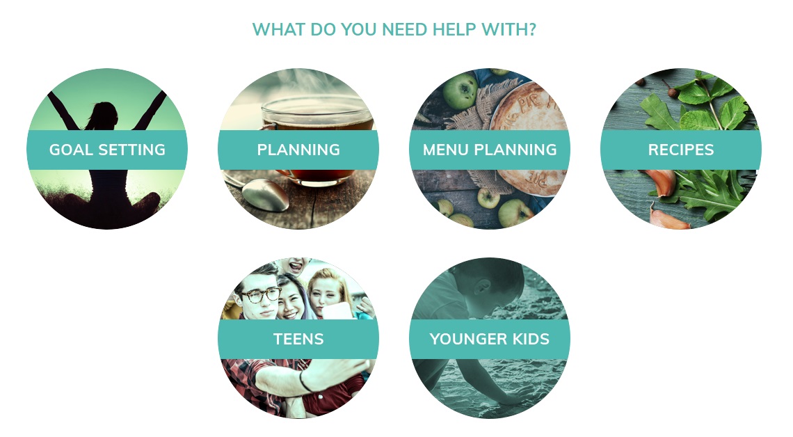
#5: A link to a “Start Here” page, or potentially to several starting points. Large, long-running blogs often include these to help new readers find their feet quickly. On Planning With Kids, for instance, Nicole Avery has this section on her homepage.
As I said, you don’t need to include all these elements. But each of them is worth carefully considering.
How to Make Your Static Homepage Look Great
WordPress’s default themes tend to be set up for classic blog homepages. So if you’re using the theme that came pre-installed on your blog (or even a different free theme), you may want to consider investing in a premium theme that lets you include dynamic content, such as a list of recent blog posts.
This type of theme will give you far more control over your homepage, and a great-looking professional design too.
We recommend (and are affiliates of) Thrive Themes and StudioPress, which means we receive a commission if you purchase via our links below.
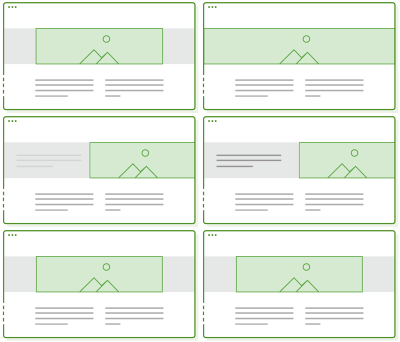
One we use extensively is Thrive Architect, a page builder by Thrive Themes you can use to design your whole site, your sales pages and other landing pages. And it works in conjunction with Thrive’s conversion-focused WordPress themes or any WordPress theme of your choice. It’s especially good for homepage design with it’s full-width and vertical split layout options.
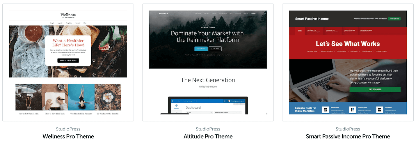
Another good static homepage solution is the themes by StudioPress (our whole team has used their themes at one point). These are specifically designed for different niches and business types. Here are a few examples.
You might want to look at other people’s static homepages for inspiration. (StudioPress has a great Showcase gallery for that.) Which ones look attractive and engaging, and why?
But don’t pack your homepage with too many different options. Focus on the things readers will most likely want to do (e.g. read some of your best posts), and the things you want them to do (e.g. find your email list).
Which Type of Homepage Would Be Right for Your Blog?
If you blog as a hobby, or your priority is driving page views, it may be worth sticking with the default blog homepage. (Some bloggers also feel this is a more “authentic” approach, which may or may not be important for your target audience.)
But if you make money selling products or services, it’s probably worth switching to a static homepage. This allows you to carefully direct readers’ experience from the moment they land on your site.
You may already have a static homepage in place. If you do, take a few minutes to review it. Make sure the information there is fully up to date, and that you’re using the page to carefully guide readers to the most important parts of your site.
Are you thinking of changing your homepage? Or are you confident that what you already have is right for you? Share your thoughts in the comments below.
Image credit: George Coletrain
The post Should Your Blog Have a Static Homepage (Whatever That Means)? appeared first on ProBlogger.
from ProBlogger
http://feedproxy.google.com/~r/ProbloggerHelpingBloggersEarnMoney/~3/eJUaI2bFz_E/
No comments:
Post a Comment